Going Retro
The visual language of old data visualization always amazed me: being able to represent complex data with a few elements and colors, and yet making it readable, is an exciting challenge.
The web is full of different examples, Nightingale, the online magazine from the Data Visualization Society has a lot of articles on this topic.
Recently, the work that W.E.B. Du Bois presented at the 1900 World Fair in Paris gained a lot of visibility, even with the publication of a monographic book with all his charts.

Another name that is often mentioned when talking about Historical Data Visualization is Charles Minard, who created the chart that someone calls The Best Graphic Ever Produced, illustrating Napoleon’s travel to Russia during his 1812 campaign.
, Public Domain")
To be clear: I’m not comparing the charts I’ll show in few lines to these great examples of complex data visualizations; I’m just explaining why when I have been asked to test chrt, I chose to try and replicate this retrò feeling.
The data
We all know what happened at the end of 2019 in China, and how this impacted the lives of almost everyone in the world. The virus reached Italy, officially, on February 24th, 2020, when Patient 0 was identified. Starting from the following month, as soon as the Italian Civil Protection released a Github repo containing all the data, Visualize News, the collective of Data Visualization professionals I am part of, created a website whose goal was to explain the Corona Virus situation in Italy to foreigners. The fastest way to start using this new library was to reuse some data I already had.
The Visualizations
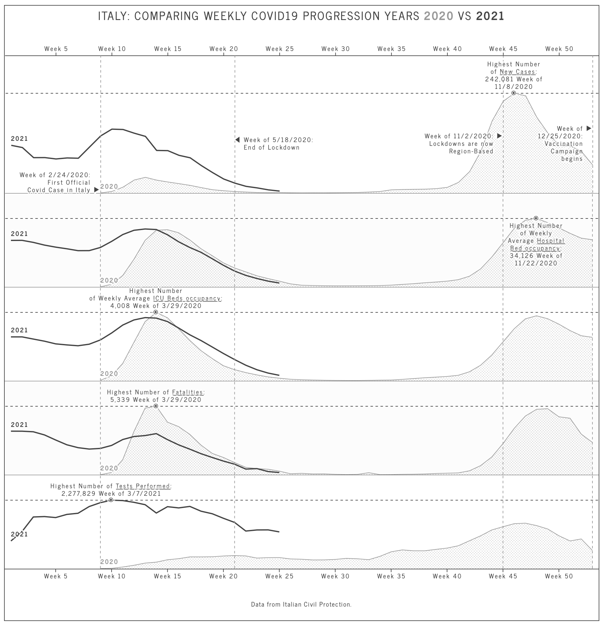
As said, I chose to plot data regarding the Covid-19 epidemic in Italy. Both plots use small multiples to compare the evolution over time.
The first one, shown here, uses multiple bar charts to highlight the weekly progression of the virus in Italy. Each bar represents a week (as indicated by the labels at the very top and very bottom of the image): all the charts share the same x-axis, but they are independent regarding the y-axis: since the goal was to show a trend and not the actual numbers, I removed the labels and ticks of the vertical axis, highlighting with an annotation the peak, and the type of data shown. The last week shows, on top of the bar, an annotation showing the figures for that week.

As you can see, I avoided using colors, replacing them with SVG patterns: I’ve been able to assign a different pattern to each bar, depending on the quality of the data it represents (cross-hatched for normal data, lines with a 45-degree inclination heading up for higher values, lines with a 45-degree inclination heading down for lower values of each category).
The second chart aims to show if the Covid-19 impact on our lives changed between 2020 and 2021. Each data point is a week; the light grey area is 2020, while the dark grey line is 2021. Again, I’ve been able to create a readable chart without the need to use any color.
At a closer inspection, you’ll notice that the grey area is, in fact, a pattern.

The code
Creating a new chart and adding data are both topics that have already been illustrated in other posts. What I want to show here is how easy it is to add annotations and axis lines to highlight certain values.
Annotations are extremely important for charts, either to explain the series themselves (like in these two examples, where I omitted axis’ titles) or to help better understand the meaning of the data.
With chrt, adding an annotation is as simple as
chart.add(
  chrtAnnotation(`<div>${label}: ${new Intl.NumberFormat('en-EN').format(maxObj.value)}</div>`)
  .top(max)
  .left(maxIndex)
);
Where .top() sets the vertical position, and .left() the horizontal position. The variables max and maxIndex are values, not pixels. chrt takes care of converting your values into coordinates based on the scale that you defined when you added the data.
And what about the markers ◉ visible in the second chart? And the position of the annotations? That’s just a bit of CSS code. It is easy, in fact, to add a custom CSS class to the annotation object, and use transform rules and pseudo-classes to change the position and layout of each annotation:
chart.add(
  chrtAnnotation(`<div>${label}:<br />${new Intl.NumberFormat('en-EN').format(maxObj.value)} Week of ${new Date(maxObj.datetime).getMonth() + 1}/${new Date(maxObj.datetime).getDate()}/${new Date(maxObj.datetime).getFullYear()}</div>`)
  .top(max)
  .left(maxObj.week)
  .class('marker')
  .class(position === 1 ? 'reverse' : 'normal')
);
Here is the CSS:
.chrt-annotation.marker:after {
  bottom: -9px;
  content: '⦿';
  display: block;
  font-size: 12px;
  height: 12px;
  left: 50%;
  line-height: 12px;
  position: absolute;
  text-align: center;
  transform: translate3d(-50%, 0, 0);
}

.chrt-annotation.marker.reverse:after {
  bottom: auto;
  top: -13px;
  transform: translate3d(-50%, 0, 0);
}
I use a position variable to choose if the annotation should be shown at the top or at the bottom of the data point, and then I change the CSS properties of the ◉ based on the class name assigned.
And what about the dashed lines highlighting the peaks or the milestones? With chrt, it’s just as easy:
chart.add(xAxisRange()
  .dashed()
  .stroke('#9a9a9a')
  .strokeWidth(1)
  .from(53)
)
The xAxisRange adds a line (or area), to the x-axis; its .from() method is used to set the positions of this additional line. The integer 53 represents the 53rd week of the year: week numbers are, in fact, the unit for my x-axis. A similar yAxisRange() method is available to add horizontal lines and works in the exact same way.
In this article, we discussed how to add and customize annotations, and how to add markers on the charts’ axis. I hope you found it interesting. For any questions or comments, please reach out to us via Twitter @chrt_io.