Sanremo Music Festival: adding colors to chrt
The Sanremo Music Festival is a major mundane event in Italy since the 1950s. Every year, soon after the Christmas break is over, new singers and old chanteurs gather in Sanremo, for a week-long competition.
The Festival has been the first real televised pop event in Italy, and it is an important part of Italian pop culture. Throughout its seventy (and counting)-year-long history, Sanremo has been showcasing basically every top Italian pop singer, as well as Eurovision winners and a lot of foreign guests (including Louis Armstrong, Elton John, Eminem, REM, Queen, and many others).
Traditionally, the event is hosted by a famous male anchorman supported by one or more vallette (or “young female assistant to the anchorman” according to the Treccani dictionary). What we’d like to find out through this visualization is whether the 2017 #metoo movement somehow managed to shake and/or alter the gender balance in the team of professionals and artists involved in this very important event at every level.

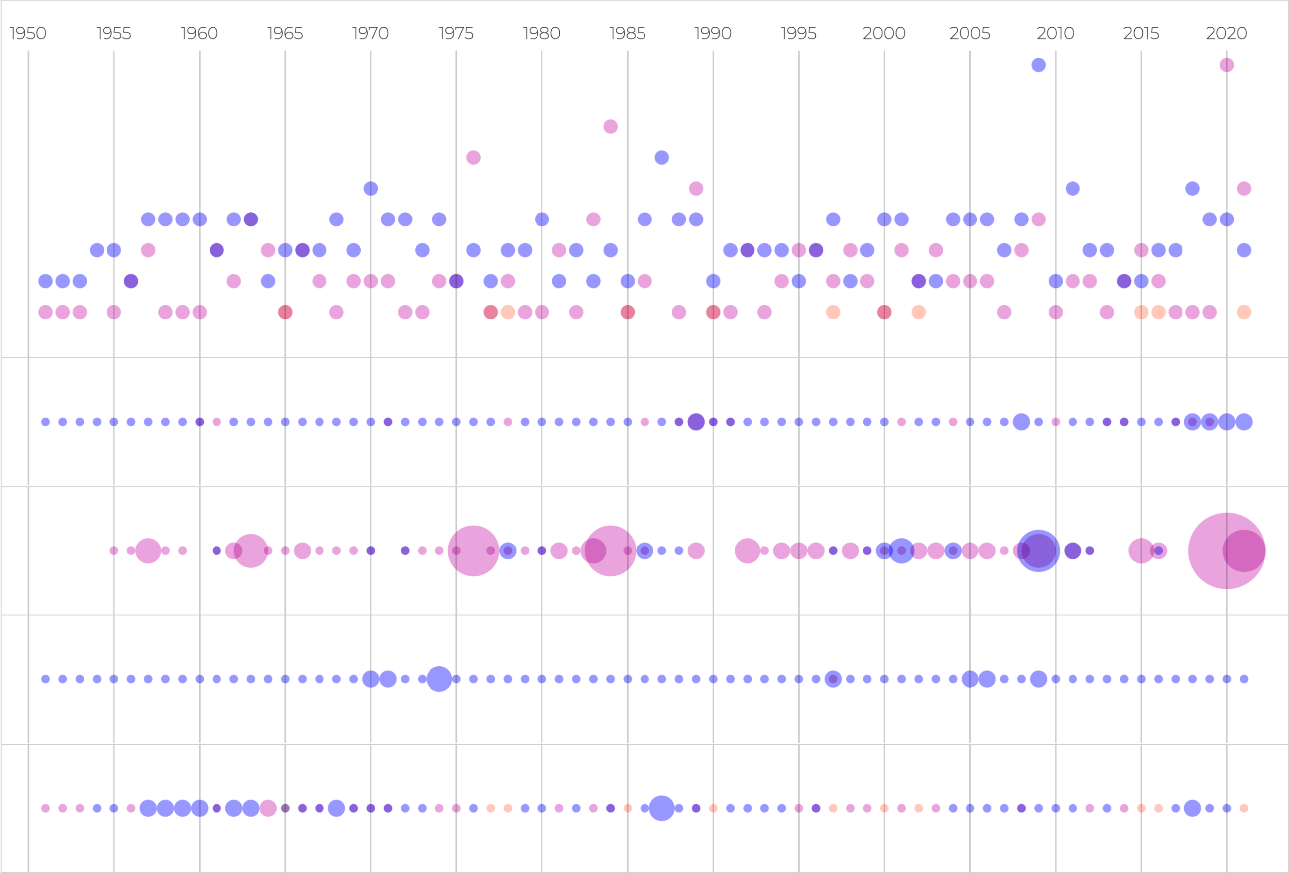
As you can see, this is not a standard chart: to create it we stacked five .chrtPoint() charts on top of each other.
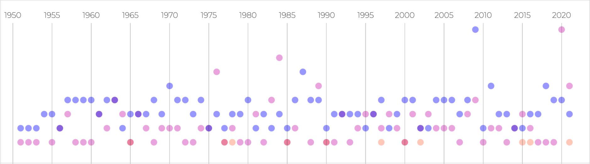
The first one shows an overview of how many male (blue) and female (magenta) professionals (hosts, assistants, artistic directors, winners) worked in each edition of the festival. The x-axis represents time (one edition each year, starting from 1951), while the y-axis shows the number of people for each gender.
The missing y-axis labels are replaced with annotations highlighting the most significant data to give some context.
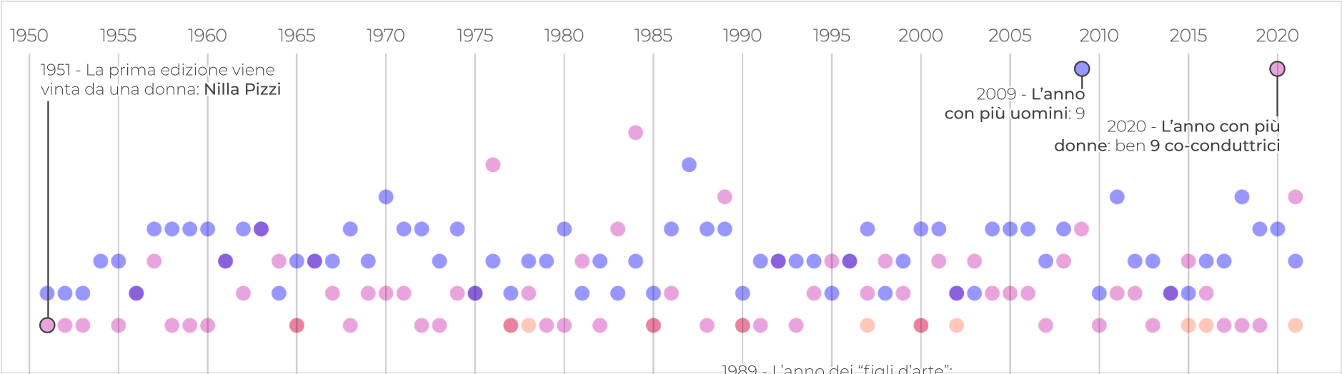
This helps us highlight one of the many inconsistencies in the history of the Festival: 2019 has been the year with the highest number of women ever (nine), yet all of them were vallette.
Creating a .chrtPoint() chart is easy, and can be done in few simple steps.
First, you create a chart, and define its global properties:
    const chart = new chrt.Chrt()
      .node(document.querySelector('#global'))
      .svg()
      .size(900, 250)
      .margins({
        bottom: 0,
        left: 0,
        right: 0,
        top: 35,
      }).padding({
        bottom: 10,
        left: 30,
        right: 30,
        top: 10,
      })
And then, you simply add a .chrtPoint() specifying your data source, and how to use it:
chart.add(
  chrt.chrtPoints()
  .data(points.map(d => ({ x: d.x, y: d.ym, })).filter(d => d.y > 0))
  .color(M)
  .radius(5)
  .stroke(S)
  .strokeWidth(1)
).add(
  chrt.chrtPoints()
  .data(points.map(d => ({ x: d.x, y: d.yf, })).filter(d => d.y > 0))
  .color(F)
  .radius(5)
  .stroke(S)
  .strokeWidth(1)
).add(
  chrt.chrtPoints()
  .data(points.map(d => ({ x: d.x, y: d.yg, })).filter(d => d.y > 0))
  .color(G)
  .radius(5)
  .stroke(S)
  .strokeWidth(1)
);
I created a separate .chrtPoint() for each series, in order to make it easier to customize the point’s .color(). My data-source has the following format:
[
  {
    "x": Int,
    "ym": Int,
    "yf": Int,
    "yg": Int,
  },
]
Where ym, yf, and yg represent the number of males, females, and bands for each year.
The following charts show a breakdown of the data, each one representing one of the professionalities included in the global overview: hosts (conduttori), assistants (co-conduttori, or vallette), artistic directors (direttori artistici), and winners (vincitori).
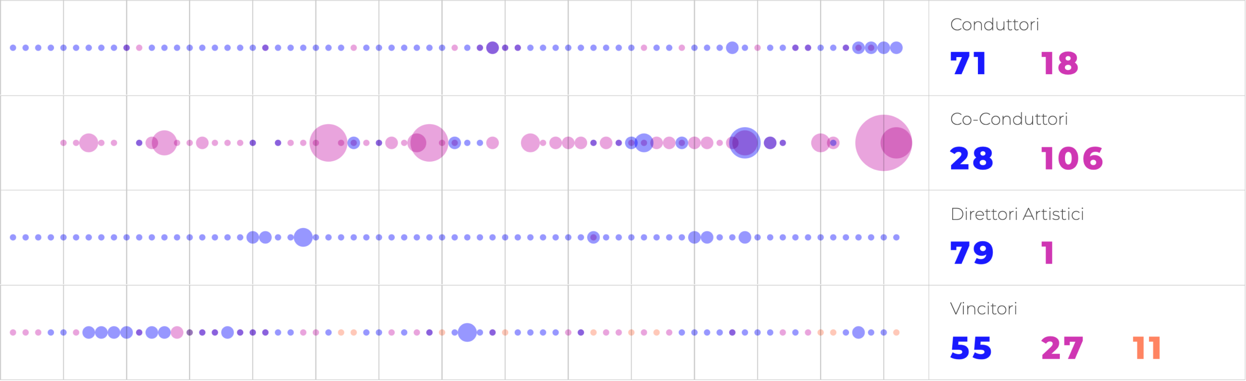
Chrt does not provide a built-in method to create dot-strips, but creating one with the tools we have it’s pretty easy: Each dot-strip is nothing more than a .chrtPoint() with a y value hardcoded to 0, and the radius of each point is proportional to the number we want to represent for that year.
This view allows us to better understand how genders are represented by role, highlighting some non-unexpected facts: women are relegated to act as assistants, while the roles of power (like artistic director and host) are dominated by men. Note how in seventy years of history, there has been just one woman acting as the artistic director.
From a code perspective creating these dot-strips is easy. After creating a chart, you can simply add the series, assigning the correct properties to each point:
.add(
  chrt.chrtPoints()
  .data(points.map(d => ({ x: d.x, y: 0, ys: d.ym, })))
  .color(M)
  .radius(d => d.ys)
  .stroke(S)
  .strokeWidth(1)
)
In this case the format of the data-source is different, and d.ys (the .radius() of each point) represents the number of persons of the currently selected gender over the total for each year. Each chart shows three separate series, one for each group. Overlapping items remain visible because I applied a mix-blend-mode CSS property to the discs.
The visualization is structured to have five Chrt .chrtPoint() charts one on top of the other. Size, positions, and margins are defined via CSS in order to harmonize the different charts into one, large visualization.
I hope you enjoyed reading how our plot about the Sanremo Music Festival has been created; I also hope this article gave you some ideas on how to approach this kind of visualization. For any comments, questions, or hints, please feel free to write to us on Twitter: @chrt_io.