Imitating the best
How can we create beautiful charts? Replicate the best!
From the first moment, we used chrt to clone charts that we liked from leading publications and inspiring books. The principle was simple: if we can reproduce the charts produced by NYT, Washington Post, Economist and others with chrt, then we will cover most of the best practices of data visualization.
Another source of inspiration we used since day one is the Datawrapper blog. We tried to replicate the charts from Greenland’s ice is melting, but without an OMG moment (that is also an experiment inspired by a chart from the Economist).
The results were exciting 🎊:
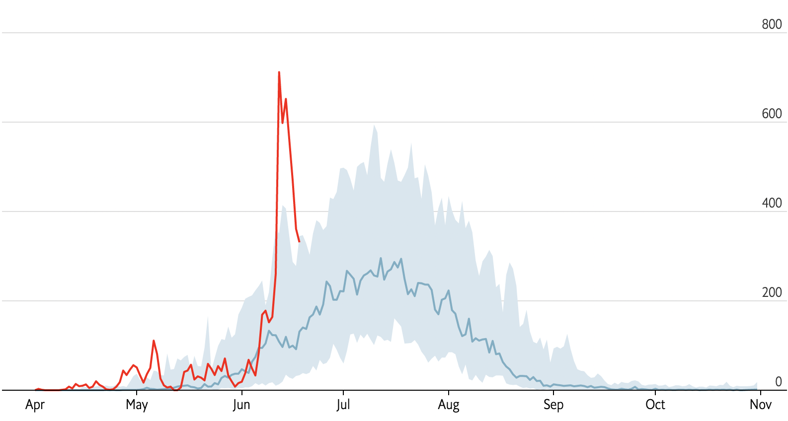
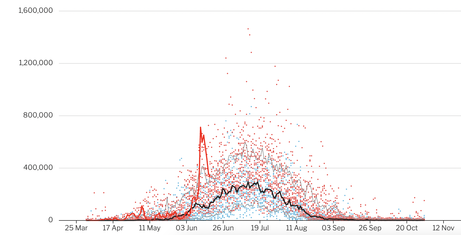
These charts ☝️ made with chrt contain multiple elements:
- lines
- scatter plot
- areas
- axis labels alignment
- axis labels formatting
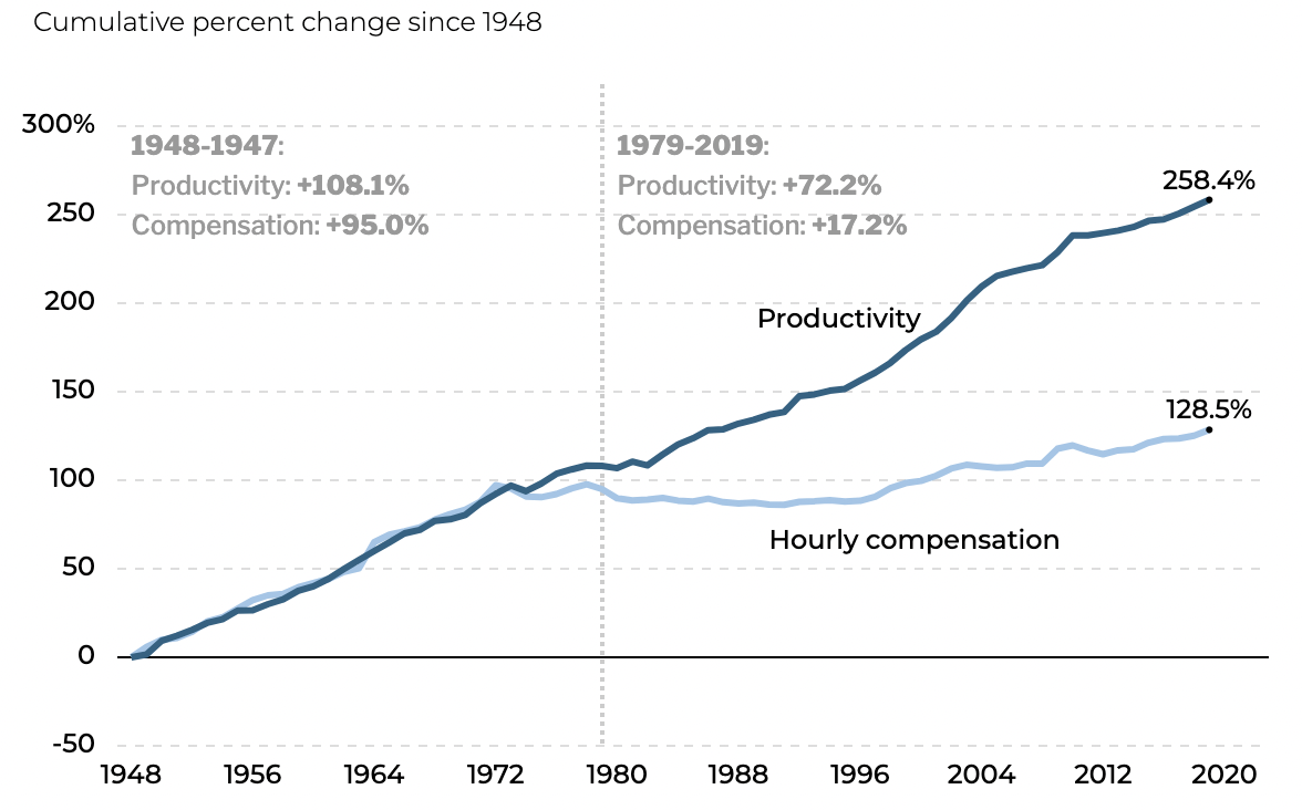
One of the first charts that we replicated with chrt is The Productivity–Pay Gap by the Economic Policy Institute, because of its abundance of elements:
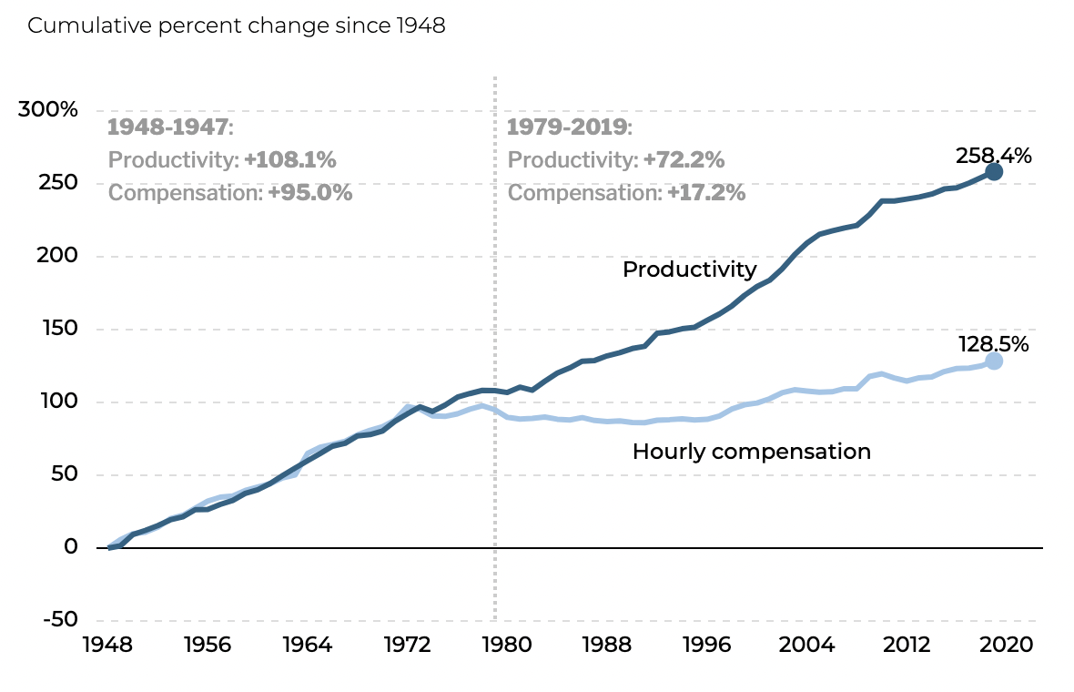
The chart replicated with chrt includes:
- annotations
- markers
- labels
- range indicator